We were thrilled to be asked to design the spring summer 2019 campaign artwork for The Finders Keepers market. The amazing team behind the Finders Keepers market approached Mosey Me founder, Eliza to create a unique Mosey-esque artwork for their summer market season. Let Eliza take you through her process below into the finished three colour ways for Melbourne, Sydney & Brisbane!
Also FK team interviewed Eliza on her inspirations and business journey so far. Read here!!
Mood board created by Eliza

Colour direction board created by Eliza

Motif Direction board created by Eliza

Hi All, Eliza here! Just thought I'd give you a look at how I created artwork for the Spring Summer Finders Keepers campaign.
Mood Board - I always start with one of these, it helps set the tone for the artwork and the overall vibe i'm trying to convey. The lovely ladies at the FK team had given me a loose brief to start off with so I was elaborated on that and added in things I thought complimented. Overall inspiration was derived from 80's interiors! modern furniture with indoor palms, neon accents, sherbet colours and lots of curved shapes and arch ways.
Colour Direction - Colour boards are always helpful at the start of each brief, sometimes I combine them with the theme board but i felt like i wanted brighter colours than what typically appears in interiors. We wanted high summer here, lots of brights but still keeping in harmonious.
Motif Direction - Motif direction board is usually just used as a reference and starting point so when pen comes to paper you have somewhere to start. Sometimes starting can be the most daunting part, it helps if you have a nudge which can just get you going then you loosen up and get comfortable with exploring, that's when the magic starts to happen, in the play stage.

Painting time! I don't usually paint in lots of colour, a lot of the time I paint in black ink or gouache paint. Sometimes I can find painting in colour a bit overwhelming if the colours aren't working properly together but I was really inspired to paint in colour for this brief! I modify them all one they are scanned in anyway but here's how I started the painting part of the journey!
Scanning time - This is where I scan all my painting material and play around with it on the computer using adobe photoshop and illustrator.

Play/ Refine/tweak - I spend SO much time in this phase usually depending on my deadline it can be weeks. A lot of the time you get playing around on computer and realise you need more brush strokes or motifs etc so back to the painting table to fill in the gaps. This is where the colour all starts to come in as well, as you can see on the centre image all my different shades and colour trials. Colour is probably one of my favourite parts, I get so excited when I nail a colour combination because its emotive and it captures people. No part of the print development process can be rushed but colour especially takes time.
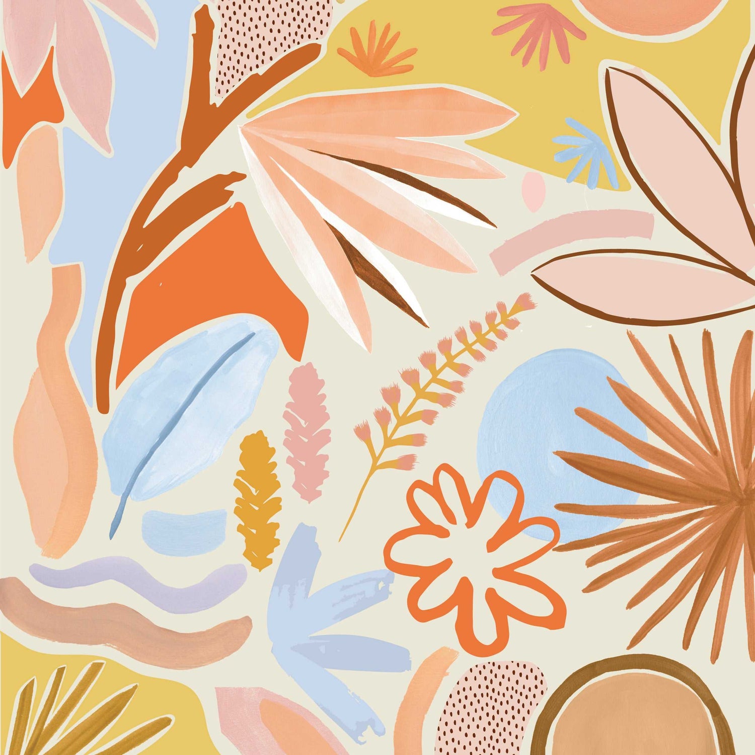
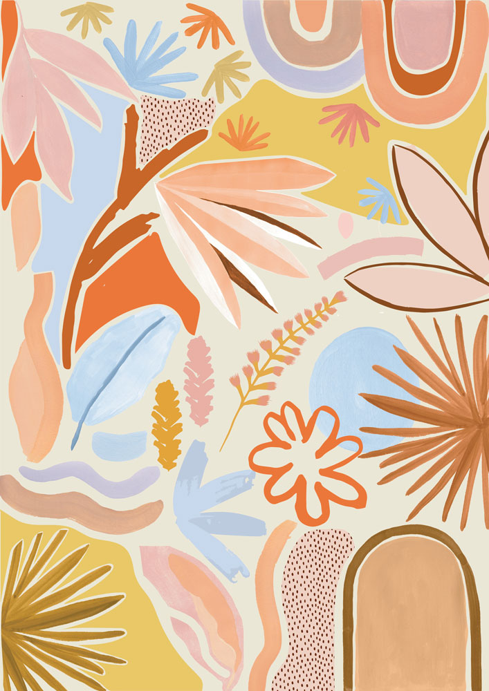
Final Outcome - Three colour ways for the three states!
Melbourne


Brisbane
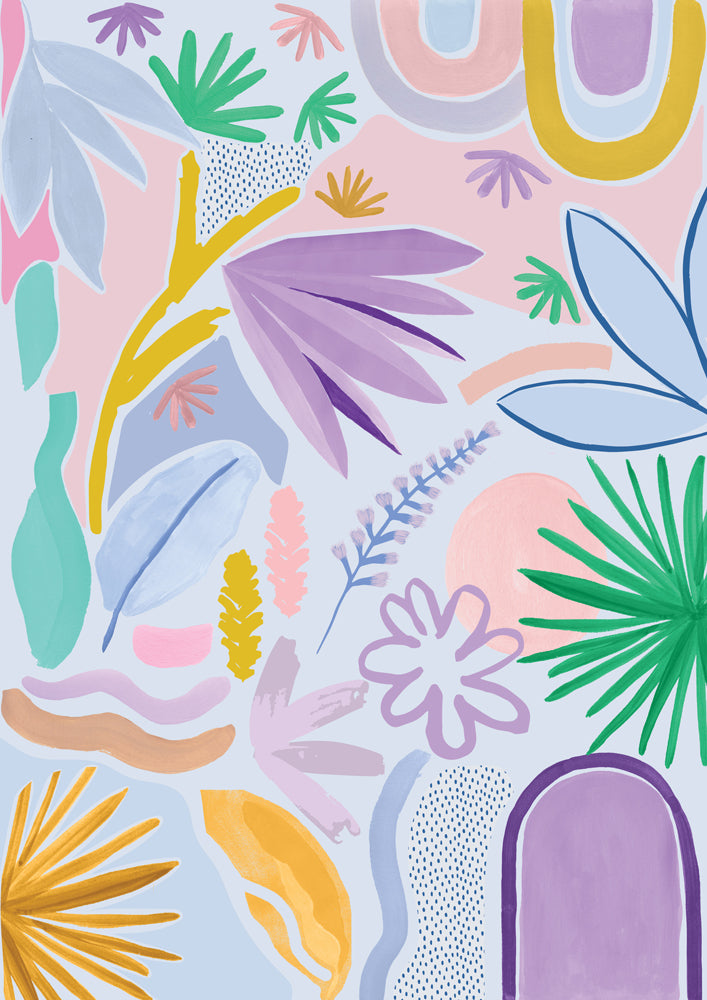


Sydney


There you have it, Finders Keepers campaign artwork done! This was such a fun project to work on, huge amount of gratitude to the FK team for allowing me the space to create some beautiful artwork for them and for believing in me not only as a brand but as a designer. It's a huge compliment and I'm extremely grateful for the opportunity. 


The beautiful graphic design work that was used to turn this into event promotion was created by Oh Babushka they did an incredible job and have such a beautiful style of their own, definitely one to follow.
Hope you enjoyed learning about the process! Let us know what your favourite colour way is?!
Leave a comment
This site is protected by reCAPTCHA and the Google Privacy Policy and Terms of Service apply.