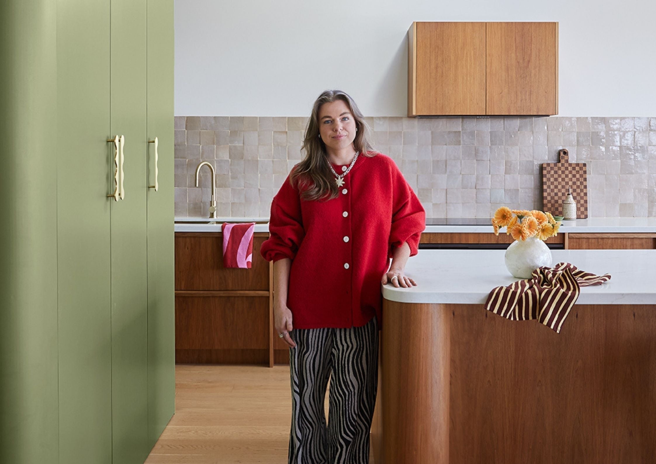
A note from Eliza
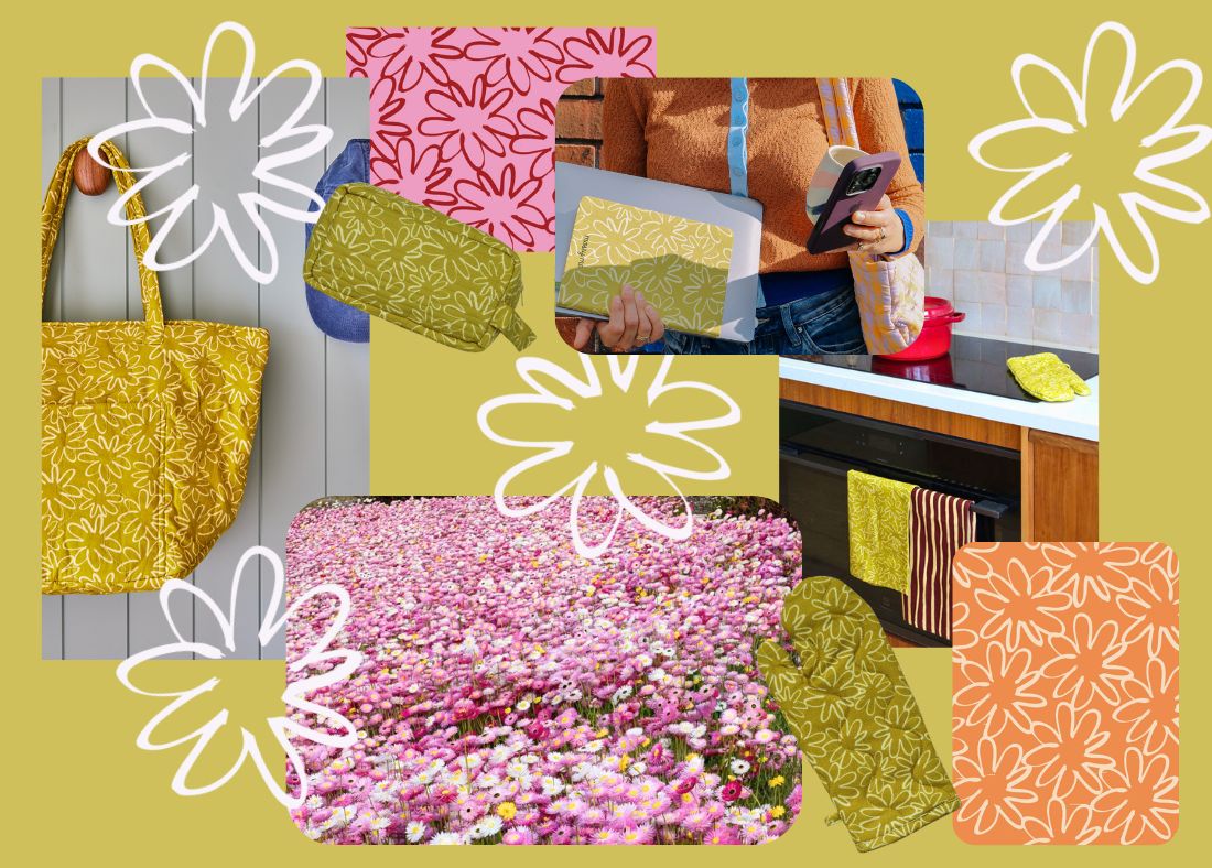
There’s a moment each spring in New South Wales when the landscape turns into something out of a dream. At the Australian Botanic Gardens in Mount Annan, a sprawling field of paper daisies bursts into bloom. I discovered this event recently, and was absolutely obsessed with the images I saw.
That fleeting scene became the starting point for Field, our latest print: a hand-drawn daisy outline in pale yellow, set against an olive/chartreuse backdrop. It’s a design that feels warm, playful and full of optimism; the feeling of standing in that field and taking a long, sun-warmed breath. Here's a little bit more into how it came to be.

The Hand-Drawn Beginning
As most of our community would know by now, every Mosey print starts with ink on paper. I always start with sketching the motifs by hand, working in black ink to capture the simplicity of line and the gesture of each shape. For Field, that meant dozens of daisy outlines: imperfect, natural, slightly wobbly, exactly like the wildflowers that inspired them. These sketches are then scanned and taken into the computer, where the building and shaping of the final pattern begins.
Once inside the digital workspace, each motif is cleaned up, adjusted and arranged. This stage is all about rhythm - repeating, rotating and resizing the daisies until the print feels harmonious and energetic. Field went through many variations: tighter clusters, looser spacing, larger florals, tiny scattered blooms. The goal was to capture the sense of abundance you feel standing in a field of paper daisies without overwhelming the eye. Only when the layout felt right did the colour exploration begin.

Finding the Perfect Palette
The real paper daisy fields at Mount Annan are a riot of colour: pinks, yellows, whites and greens. But for the final print, I wanted something more graphic, something that held the essence of the field without becoming overly literal. Reducing the artwork to two colours gave Field a clean, modern edge that feels distinctly Mosey.
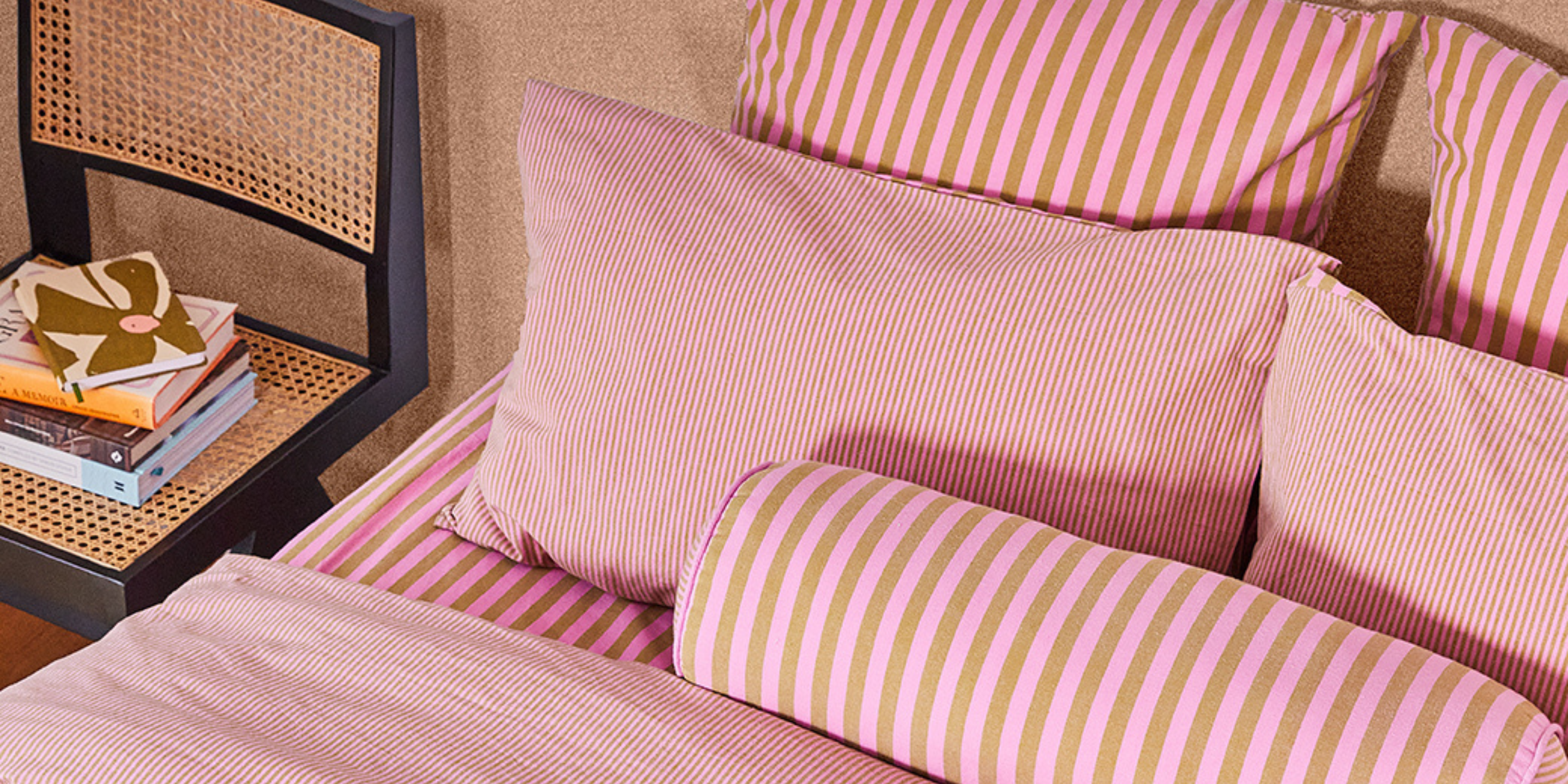
After exploring many combinations, I landed on the pairing of soft pale yellow daisies floating on an olive/chartreuse ground. It feels sunny, fresh, and can be taken from spring to summer and beyond.

The final result
Field is warm, graphic and full of movement - a reminder of spring’s brightness and summer’s easygoing spirit. It’s the kind of print that carries you from slow mornings to long holidays, from home rituals to days spent outdoors. I loved creating Field, and I hope it brings the same happiness to your home as that real field of flowers did for me.


Leave a comment
This site is protected by hCaptcha and the hCaptcha Privacy Policy and Terms of Service apply.