Eliza walks you through her design process for the latest addition to the Mosey print family.
Some prints feel so at home in the Mosey world that it’s hard to believe they haven’t always been there. Tulip Fields is exactly that kind of design — a seamless addition that somehow feels both fresh and familiar. But despite how naturally she fits, this print is brand new, and we thought she deserved a proper introduction.
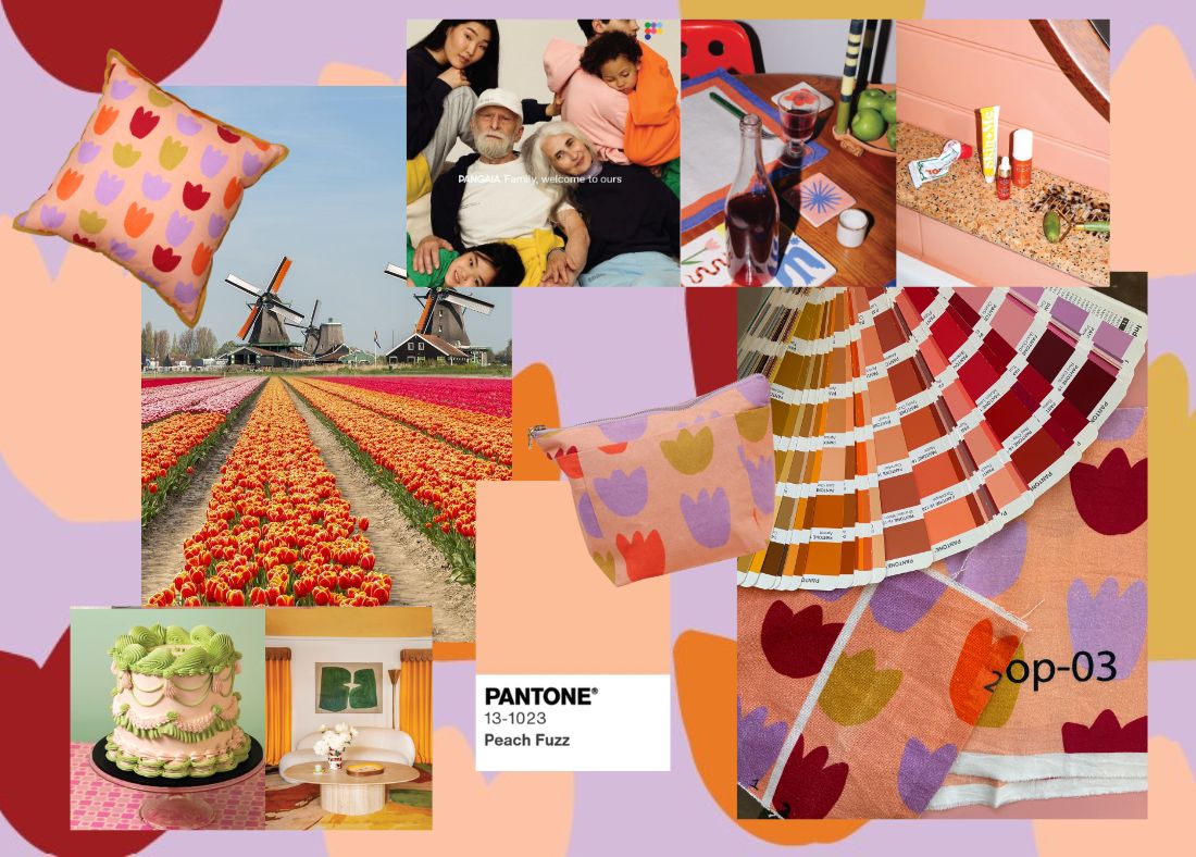
A Flower Close to Our Hearts
Florals have always been a part of Mosey's DNA — but in our own way. I love to play with scale and keep things bold and graphic, rather than leaning into traditional prettiness. Tulips, in particular, are a winter bloom that caught our eye for their charm and structure. Inspired by Scandinavian simplicity and the sprawling tulip fields of the Netherlands, Tulip Fields grew out of a deep appreciation for this beautiful, cool-climate flower.

From Ink to Icon
As with all our prints, Tulip Fields began by hand. The design started with a simple black ink painting of a tulip bulb. Working in black and white helps me focus purely on form and composition — the print has to hold its own without the distraction of colour. Only once it passes that test do I consider it strong enough for the collection.
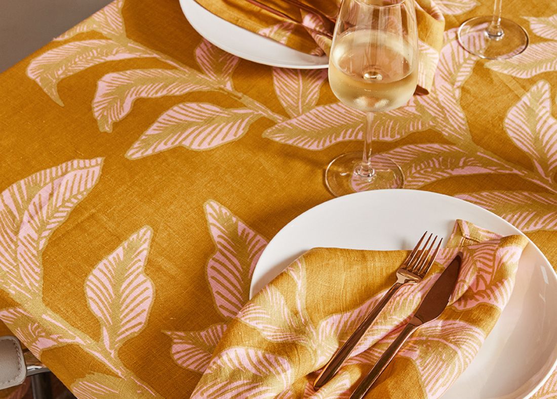
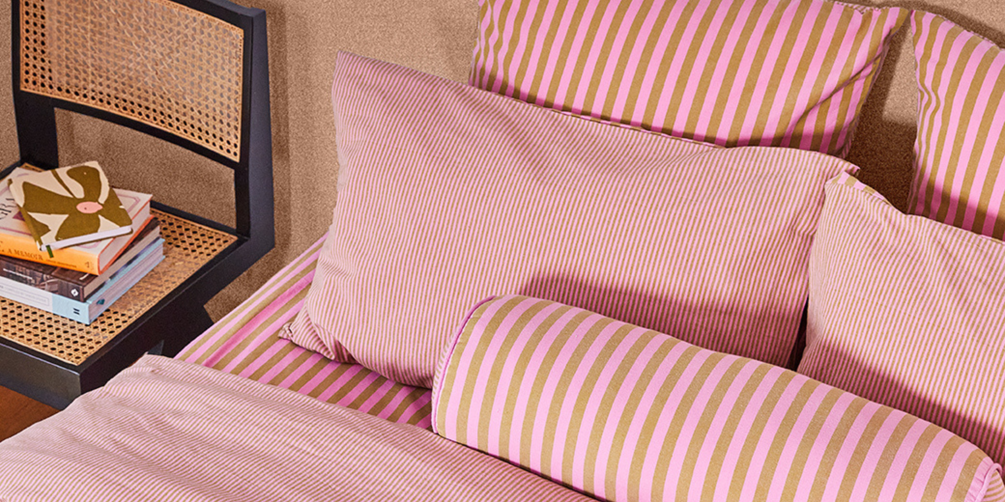
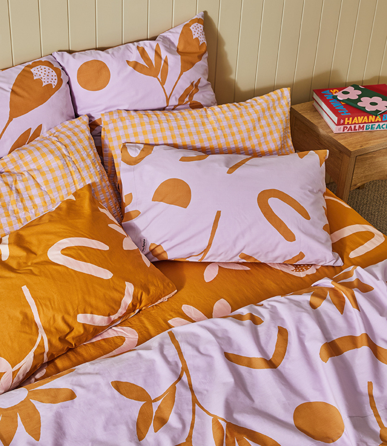
This tulip motif originally made its debut in our bedding range. But the bold lines and timeless shape had more to give - I quickly realised it had the versatility to be carried through to other parts of the collection.
A Colourful Shift
For accessories and bathroom, I wanted something small in scale and rich in colour. The final format came after experimenting with different tulip sizes and colour treatments — from minimalist two-tones to vibrant multi-colour approaches. In the end, a clean, repeat-style print reminiscent of a stamp design felt just right.

Choosing the colour palette is always an intuitive yet thoughtful process; a combination of studying our seasonal moodboards and considering the Mosey range as a whole. Warm tones led the way. I landed on a beautiful, peachy base layered with pops of Barbados cherry, lilac and olive green — a combination that felt both joyful and cozy. Once the palette was decided, I selected exact Pantone colours and sent them off to our manufacturer for sampling across all the fabrics we planned to use.
The result was everything we hoped for — fun, vibrant, and totally at home in Tivoli.

Shop Tulip Fields here.

Leave a comment
This site is protected by hCaptcha and the hCaptcha Privacy Policy and Terms of Service apply.