A note from Eliza
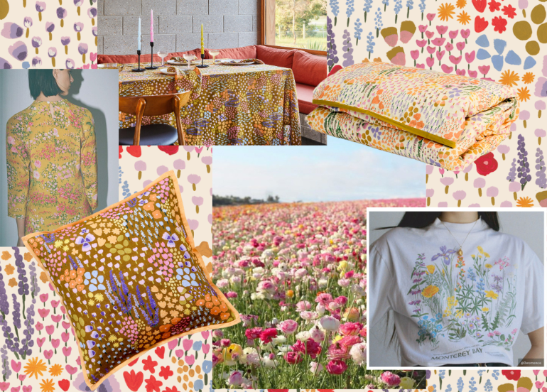
The Meadow print has been in the works for quite some time now, taking many iterations and forms over its life. And while nature always inspires our prints, this one was a little different for us. Usually drawn to more oversized, graphic prints, this time I wanted to create more of ditsy print but still make it feel Mosey.
For this collection I took inspiration from summer wildflower fields. My mood board was covered with imagery of fields full of multicoloured flowers, all small and dainty, that together create a carpet of colour. When translating these images into print, I knew I wanted an array of different flowers and colours to play with and to experiment on different coloured bases.
Like all my prints I started by getting the paints out, plugging my headphones in and getting into a flow. And it was a really fun process. I set the intention over a few days and knew what I wanted to create, then went in and painted it. Unexpectedly I actually painted this print in colour first, which is rare for me as I usually like to paint in black ink to keep it simple. But for this one the mosaic of colour felt important from the outset and informed the whole creative flow.
Once I had the first iteration of the print on paper, I then started to play with various versions on the computer. It started as an art print first, and then quickly found its way into both tableware and bedding. The print just felt so versatile and really takes on a different character with each colour palette, so both Jessie and I felt it deserved to exist in a few places in the collection.
 Meadow
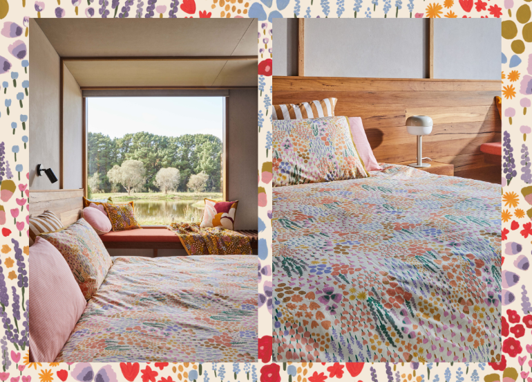
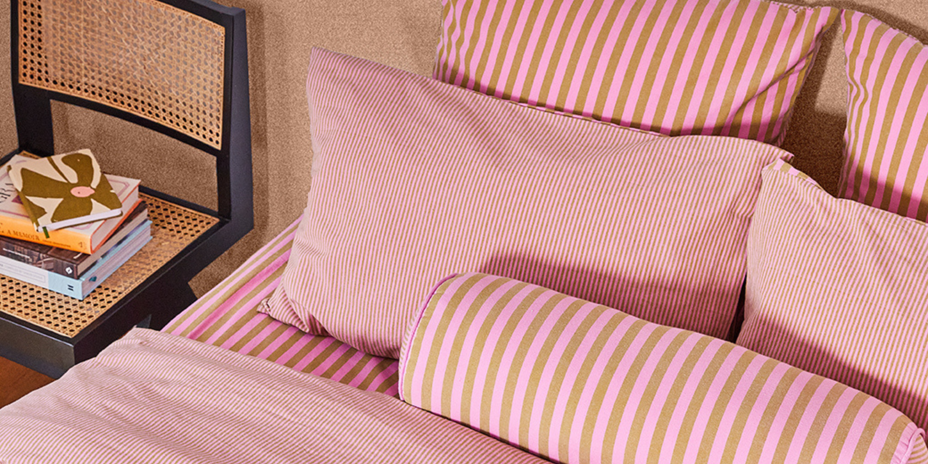
 For bedding, the intention was to give the print a bright, light quality that would lift the space and create a sense of harmony and calm in the bedroom. So, we went with an overall warm tone and a light base. Instead of our usual method with print of pairing two different prints together (one on each side), we decided to make the Meadow bedding an all-over style to really let the print shine. The addition of the tan flange trim ties it all together.
 Meadow
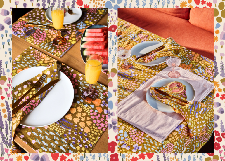
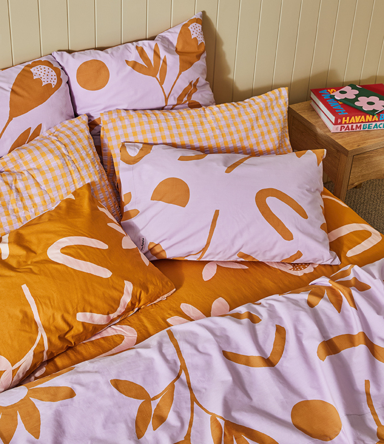
 For tableware, we knew we wanted something a little bolder, I loved seeing the colours pop on the khaki/chartreuse ground. It feels strong but not overpowering, and really lifts a table instantly without much effort. You don’t need a busy tabletop with flowers or anything, as the print creates the mood straight away. I also love how the quality of the colours and print change depending on the light. The golden tones that come through with the afternoon sun is particularly beautiful. Summer dining at it’s best.
Shop Meadow here.
Leave a comment
This site is protected by hCaptcha and the hCaptcha Privacy Policy and Terms of Service apply.